05
Amgen · Enbrel

CRM Email Audit & UX Optimization

An eight-email patient onboarding cadence with open rates above benchmark but CTR below. A full UX audit across every touchpoint — diagnosing why patients opened and didn’t click, and redesigning each email to close the gap.

CRM Audit Email UX Cadence Optimization UX Framework Patient Onboarding FDA Regulated
Amgen Enbrel — CRM Email Audit & UX Optimization
36%
Unique open rate (industry benchmark: 21%)
4%
CTR vs. 5.5% benchmark — the brief
7
Emails audited across Day 0–45 cadence
Challenge
Problem reframe
UX approach
Decision log
Research → insight
Deliverables
Hindsight
The challenge

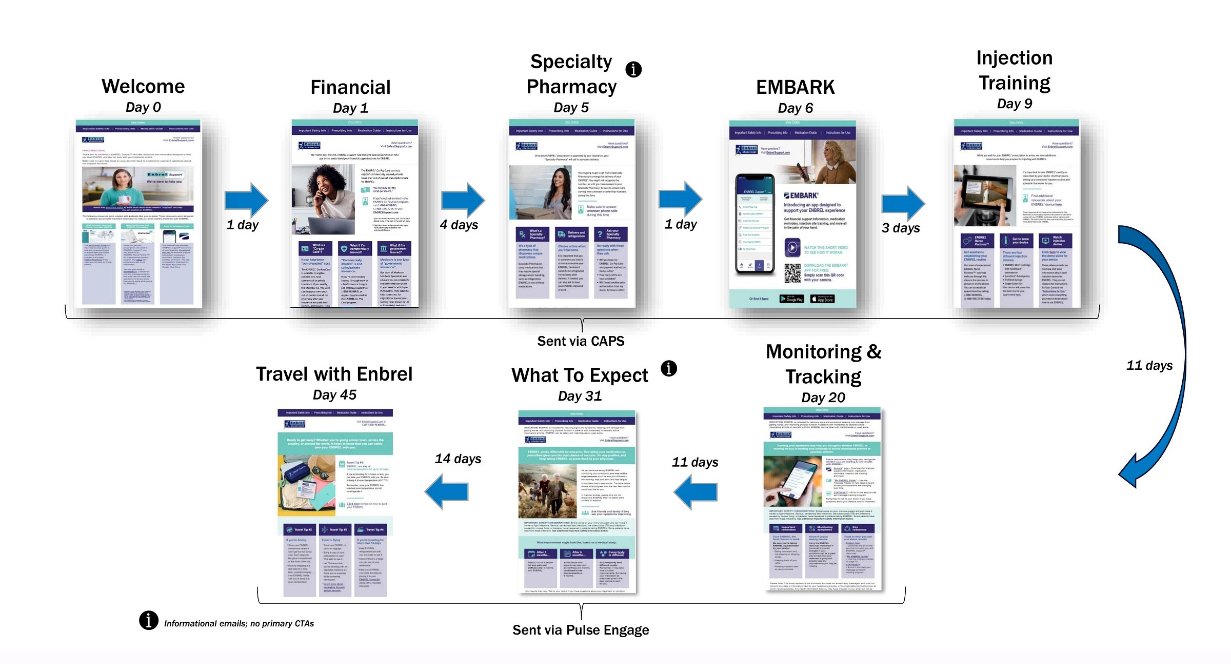
The Enbrel patient onboarding program was a fully built CRM cadence — eight emails deployed over 45 days from the moment a patient enrolled, covering welcome, financial support, specialty pharmacy, the EMBARK® app, injection training, monitoring and tracking, what to expect, and travel with Enbrel. By open rate standards, it was performing well: 36% unique open rate against a 21% industry benchmark.

The problem was at the next step. Unique CTR sat at 4% against a 5.5% industry benchmark — patients were opening and stopping. Something in the experience between subject line and click was failing, and it was failing consistently across multiple emails, which ruled out single-email creative problems. The brief was to audit the full cadence, identify the UX failure patterns, and deliver optimization recommendations across every touchpoint.

My role: I led the UX audit across all seven emails — analyzing click data by email type, applying a structured UX framework to each, and producing annotated before/after redesign wireframes with specific optimization rationale for each touchpoint. Delivered in coordination with Amgen’s Customer 360 analytics team and presented to the client as actionable 2022 recommendations.

Working across teams

Led agency-side within Arnold NYC — framing UX findings as strategic recommendations internally before they reached Amgen, not as options requiring client arbitration. Every recommendation was grounded in Amgen's own Customer 360 click data. The Scan/Comprehend/Engage framework gave both teams a shared vocabulary, compressing review cycles on both sides.

From brief to reframed problem

The brief described a CTR problem. The UX audit revealed it was a content density and fold architecture problem operating at different levels across different email types.

Client brief

“Audit the CRM email touchpoints and provide optimization recommendations that will help drive higher engagement and click-through to Enbrel.com. Unique open rate is strong — we need to improve CTR.”

Reframed UX problem

This isn’t a single CTR problem — it’s two structurally different problems by email type. Actionable emails (Welcome, Financial, Injection Training, EMBARK, Monitoring, Travel) failed at scan and engage: content density above the fold buried the CTA, and users couldn’t orient to what action was being asked before losing interest. Informational emails (Specialty Pharmacy, What to Expect) had no primary CTA by design — their 3% CTR was an architecture problem, not a creative one. The optimization framework had to treat them differently, not uniformly.

This reframe drove the two-track optimization strategy: CTA-above-fold restructuring for actionable emails, and multiple secondary engagement points for informational emails where no primary CTA was appropriate.

Transferable to

Any regulated patient support CRM program. The Scan/Comprehend/Engage framework and the two-track actionable/informational email distinction apply directly to any pharma onboarding cadence. The pattern of strong open rates masking below-benchmark CTR is common in regulated CRM — subject line optimization gets the open, but fold architecture and content density determine the click.

UX approach

I structured the audit around a three-stage UX model applied consistently across every email: Scan (can the patient orient to what this email is about before the fold?), Comprehend (is the key information findable without hunting?), and Engage (is the action point obvious and accessible?). This gave the audit a repeatable, defensible framework rather than a collection of ad hoc creative notes — and gave the client a vocabulary for evaluating the recommendations.

For each of the seven emails I documented: what the 2021 click data showed about where patients were engaging and dropping off, what the UX failure pattern was at each fold, and what structural changes would address it. Recommendations were tied to specific UX rationale rather than aesthetic preference — reducing header depth to move CTA above fold, single-topic focus to reduce comprehension load, segmentation to serve incompatible user intents separately.

The audit was also informed by click data from Customer 360 showing that singular-focused emails (Injection Training, EMBARK) were outperforming multi-topic emails on CTR — which validated the core optimization direction before the redesigns were presented.

Key design decisions
Decision point Alternatives considered What we chose & why
Audit scope — uniform optimization vs. two-track approach
Apply the same Scan/Comprehend/Engage optimization logic uniformly across all seven emails regardless of email type.
Two-track approach. Actionable emails and informational emails had structurally different failure modes. A uniform CTA-above-fold recommendation would have been inappropriate for Specialty Pharmacy and What to Expect — which had no primary CTA by program design.
Header depth — maintain brand header vs. reduce depth
Maintain full Enbrel header, logo, and salutation block above the fold to reinforce brand trust before the CTA.
Reduce header depth across all actionable emails. Click data showed majority of engagement came from above-fold CTA areas. The existing header block pushed primary content — and the CTA — below the fold on most mobile clients, where the majority of opens were occurring.
Financial email — maintain three-column format vs. single focus
Keep the existing three-column layout (Co-Pay Card / Commercially Insured / Government Insured) to cover all financial scenarios in one send.
Single focus on the Co-Pay Card benefit above the fold, with audience segmentation. The three-column layout required patients to self-identify their insurance type before engaging — a comprehension step that was suppressing action. Segmenting into private vs. government streams removed the self-identification burden.
Video engagement — passive video embed vs. active play trigger
Keep existing static video thumbnail with standard play icon. Video engagement was already the top click driver in Welcome and Injection Training.
Add explicit play button icon overlaid on the hero image with a link CTA adjacent to it. Click data confirmed video was the primary engagement driver — making the play action more obvious and accessible was the lowest-effort, highest-impact optimization available.
EMBARK email — feature list vs. single app focus
Maintain existing multi-feature list layout (financial support, injection tracking, medication reminders, EMBARK Nurse Partner) with parallel copy blocks.
Single focus on the EMBARK app with feature callouts as a supporting hierarchy, not the lead. Multi-feature lists split attention and delayed the primary action — download the app. Singular focused emails (Injection Training) had significantly higher CTR in the Customer 360 data, validating the consolidation.
Research → insight → recommendation
Research input
Customer 360 click analytics by email, 2021 campaign data

Unique open rates, unique CTR, and click source data segmented by email type across the full cadence. Actionable emails: 4.9% CTR. Informational emails: 3% CTR. Top click sources: CTA Onboarding Video (Welcome), financial enrollment CTA (Financial), app download (EMBARK), injection demo video (Injection Training).

Key insight
Singular focused emails outperformed multi-topic emails consistently

Injection Training and EMBARK — both single-topic emails — drove the highest CTRs in the actionable segment. Welcome and Financial — multi-topic emails with competing content blocks — underperformed. The data validated the hypothesis that content density above the fold was suppressing engagement, not creative quality.

UX recommendation
Restructure each email around one above-fold action, support below

Reduce header depth to surface the primary CTA above the fold on mobile. Lead each email with a single content focus. Move secondary resources and engagement opportunities below the fold as supporting content rather than competing priorities. For informational emails, replace primary CTA with multiple lightweight engagement points distributed throughout.

Transferable to

Any regulated patient support CRM program. The Scan/Comprehend/Engage framework and the two-track actionable/informational email distinction apply directly to any pharma onboarding cadence. The pattern of strong open rates masking below-benchmark CTR is common in regulated CRM — subject line optimization gets the open, but fold architecture and content density determine the click.

Figure 01 · CRM cadence Eight emails, Day 0–45
Amgen Enbrel CRM onboarding cadence — eight emails, Day 0 to Day 45

Current Enbrel CRM patient onboarding cadence at the time of the audit — eight emails deployed over 45 days from enrollment. Welcome (Day 0) and Financial (Day 1) delivered via CAPS to all patients. Specialty Pharmacy (Day 5), EMBARK (Day 6), Injection Training (Day 9), Monitoring & Tracking (Day 20), and Travel with Enbrel (Day 45) delivered via CAPS. What to Expect (Day 31) delivered via Pulse Engage — designated informational, no primary CTA. The audit covered all seven non-system emails; recommendations were sequenced by impact potential based on click data.

The cadence map gave the audit a shared reference frame — client and agency could see the full 45-day arc before evaluating individual email performance.
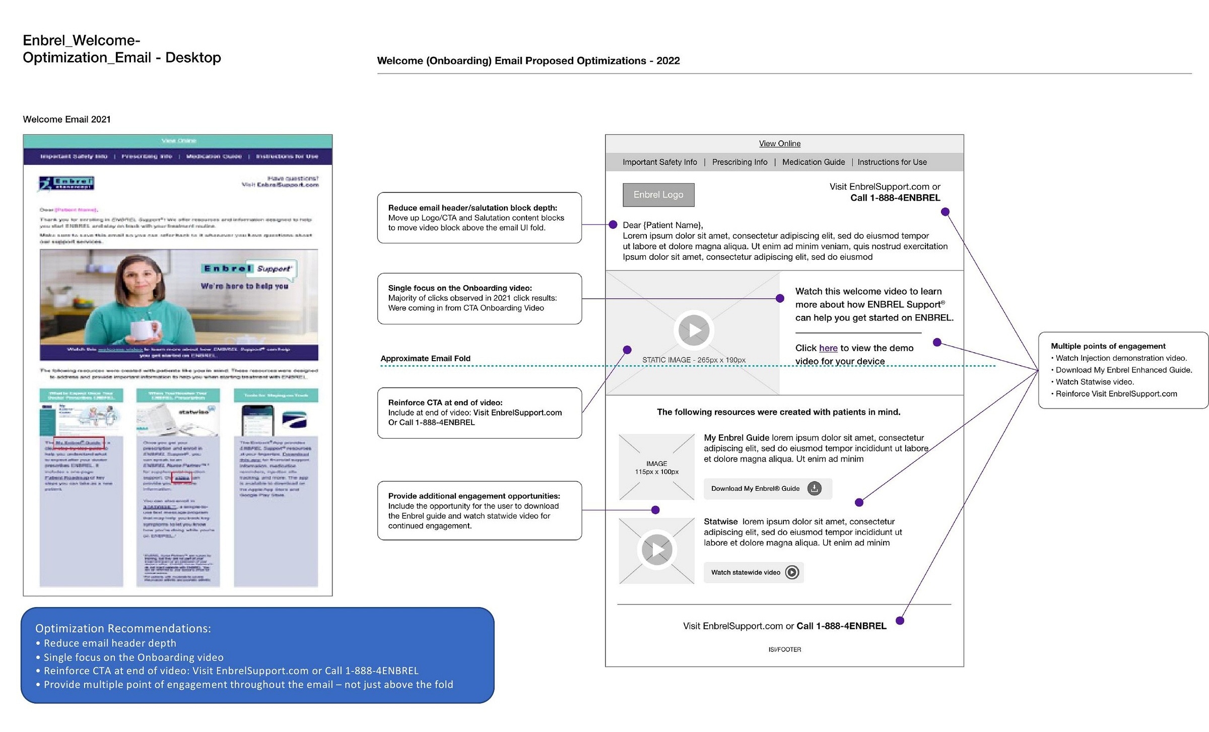
Figure 02 · Welcome email Before & after — onboarding email optimization
Enbrel Welcome email — 2021 original vs. 2022 proposed optimization

Welcome (Onboarding) email — 2021 original (left) vs. 2022 proposed optimization (right). Original: full header block, salutation, and brand intro paragraph above fold; primary onboarding video CTA buried below. Optimization: reduce header depth, move video block above fold, reinforce CTA at end of video, add multiple secondary engagement points below fold (injection demo video, My Enbrel Guide download, Statwise video). Primary optimization driver: 2021 click data showed majority of Welcome email clicks originating from the Onboarding video CTA — bringing it above the fold was the single highest-impact structural change available.

Moving the onboarding video above the fold was the single highest-impact structural change: click data showed it was already the primary engagement driver — the fix was surfacing it, not creating something new.
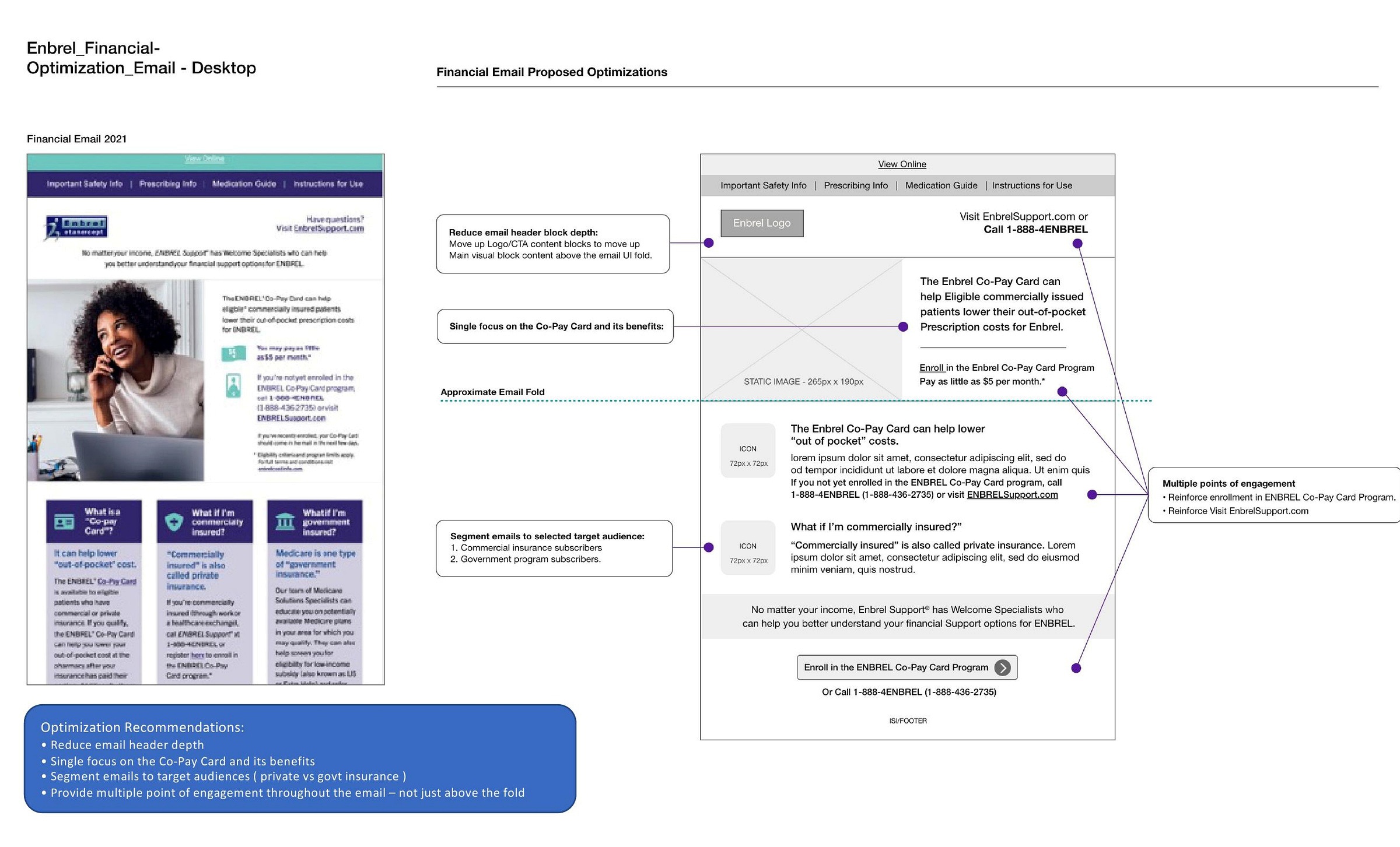
Figure 03 · Financial email Before & after — single focus + audience segmentation
Enbrel Financial email — 2021 original vs. 2022 proposed optimization

Financial email — 2021 original (left) vs. 2022 proposed optimization (right). Original: three-column layout presenting Co-Pay Card, Commercially Insured, and Government Insured scenarios simultaneously, requiring patients to self-identify their insurance type before engaging. Optimization: single above-fold focus on the Co-Pay Card benefit and enrollment CTA; segment the email into two streams (commercial insurance subscribers, government program subscribers) so each patient receives a version relevant to their actual situation. Comprehension burden removed; enrollment CTA made the unambiguous primary action.

Removing the self-identification burden from the financial email resolved the primary comprehension failure — patients who couldn't quickly determine which option applied to them were abandoning before the CTA.
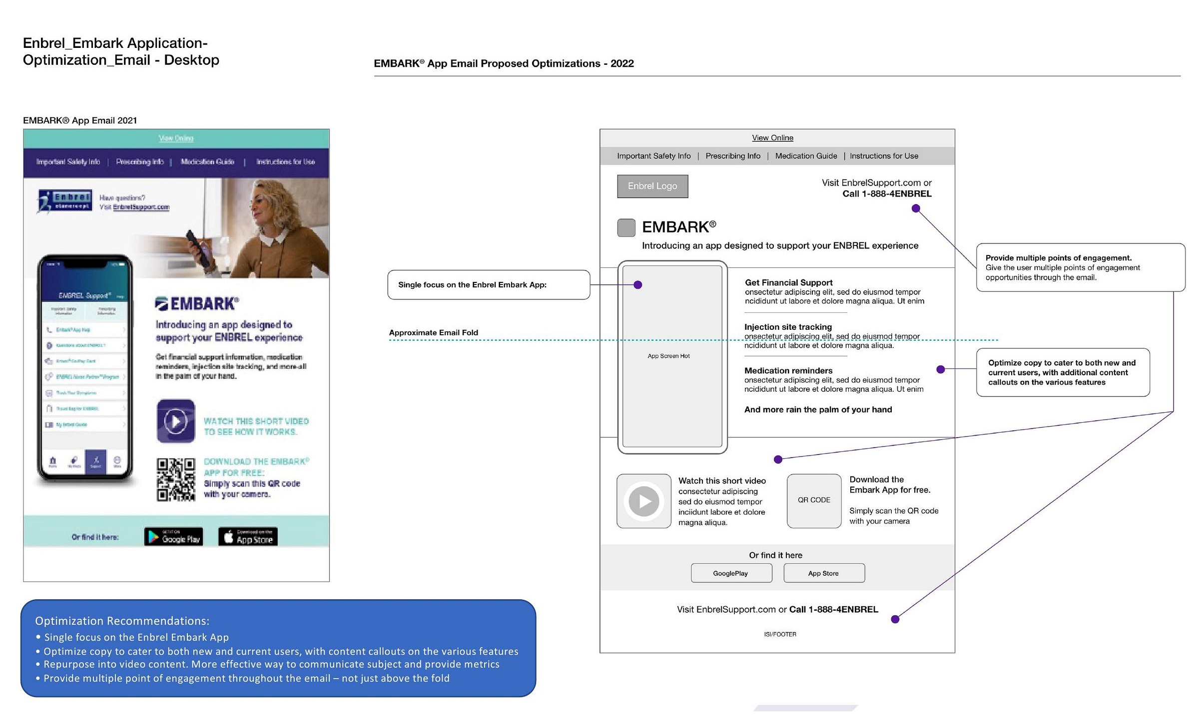
Figure 04 · EMBARK® app email Before & after — multi-feature to single focus
Enbrel EMBARK app email — 2021 original vs. 2022 proposed optimization

EMBARK® App email — 2021 original (left) vs. 2022 proposed optimization (right). Original: multi-feature layout leading with a list of four app capabilities (financial support, medication reminders, injection tracking, EMBARK Nurse Partner) with parallel copy blocks competing for attention. Optimization: single focus on the EMBARK app as the primary entity, with feature callouts as a supporting hierarchy; QR code and app store links consolidated below the feature section; optimize copy to serve both new and current EMBARK users from one email rather than treating them as the same audience. Customer 360 data showed singular-focused emails consistently outperforming multi-topic emails on CTR — this email had the widest gap to close.

Consolidating from multi-feature list to single-focus reduced the attention split that Customer 360 data showed was suppressing EMBARK app downloads — the highest-priority CTR gap in the cadence.

Role
UX audit lead, email redesign, optimization framework
Deliverables
UX audit across 7 emails · Before/after redesign wireframes (7 emails) · Scan/Comprehend/Engage framework applied per email · Click data analysis · Cadence timing review · Client presentation deck
Regulatory context
FDA · MLR-reviewed patient CRM · CAPS + Pulse Engage
Industry
Pharmaceutical · Biologic · Patient onboarding · CRM
If I ran this again

The Scan/Comprehend/Engage framework gave the audit a defensible structure and made the recommendations feel like UX strategy rather than creative opinion — that was the right call. Two things I’d push for: a post-implementation measurement plan agreed before the recommendations went to MLR, so the 2022 optimizations could be evaluated against the same Customer 360 metrics that identified the problem. And I’d have pushed harder on audience segmentation as a systemic recommendation rather than just a Financial email fix. The click data suggested several emails were serving incompatible user states simultaneously — a patient at Day 6 who already downloaded EMBARK and a patient who hadn’t were receiving the same EMBARK email. Segmentation at the cadence level, not just within individual emails, would have been the more structural solution.