Patient Experience Redesign & UX Research Leadership
Diagnosing a dual-audience architecture failure after a site redesign collapsed engagement metrics, then leading the research commissioning and UX redesign that charted the path back.

The condition-first homepage as designed, on mobile: the hero and "How can ENBREL help you?" condition selector open the page, followed by the SupportPlus module. Click to scroll the full page, including Important Safety Information and Indications as placed for MLR. The wireframes in the tabs below show the structure behind it. Captured during the engagement; enbrel.com has since been updated.
The brief came in as a navigation and content findability problem. The diagnosis revealed an architectural failure two levels deeper.
“The redesigned site is underperforming — users can’t find what they need. Fix the navigation and improve content findability.”
This isn’t a navigation problem — it’s a dual-audience architecture failure. Enbrel.com serves two fundamentally different users: prospective patients deciding whether to start Enbrel, and current patients who need support, financial resources, and adherence tools. The redesign treated them as one. No amount of navigation improvement resolves an architecture that assumes a single user intent.
This reframe changed scope from incremental fixes to a structural solution — driving the dual-path homepage architecture that became the foundation of WEBDEV2.0.
Multi-audience regulated digital experiences. The dual-audience architecture failure pattern applies across any regulated brand serving more than one user intent from a single digital property — pharma DTC/HCP, device manufacturer patient/provider, and payer member/broker experiences all face the same orientation failure when architecture assumes a single user intent.
Drop-off was immediate and homepage-driven, not distributed across the site. Bounce rate spiked from 63% to 69% within the first week post-launch and reached 89% within three months. Concentration at the homepage confirmed users were failing to orient at the first interaction — not failing to find specific content after navigating in.
I treated this as an architecture problem before a design one — first building the evidentiary case from 14 months of analytics that the metric collapse had a single structural cause, then commissioning an independent Ipsos study to move from hypothesis to client-defensible evidence. The redesign itself was condition-first: “Choose Your Condition” became the primary entry point, separating prospective and current patient paths from the first interaction.
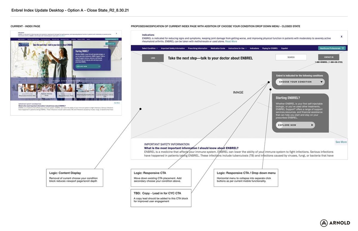
Homepage index page redesign — before/after comparison with annotated UX rationale. Arnold NYC, August 2021 (R2). Left: current site with the flat, undifferentiated homepage structure and condition-selection buried below the fold. Right: proposed redesign with annotations for navigation restructuring, responsive CTA placement, and condition-first dropdown implementation. Three annotated decisions: content display (removing condition block reduces scroll depth and bounce risk), responsive CTA (add condition-selection above fold), and navigation (horizontal menu collapses to separate-click buttons per mobile UX patterns).
The annotated before/after gave the client a visual argument for scope change — moving the conversation from 'fix the nav' to 'rebuild the architecture.'
Homepage before/after — R8 (left) vs. R14 (right). Before: generic brand hero (“I’M IN for what’s next”) with no condition-entry point, no patient-path separation, and a generic Paying for ENBREL CTA as the primary above-fold action. After: condition-first architecture with “Thinking about ENBREL?” prospective patient hero, the “Choose Your Condition” dropdown as the primary navigation entry, and a scrolled current-patient path (“Already have a prescription?”) separating the two user intents. The structural shift resolved the dual-audience failure that drove bounce rate from 63% to 89%.
The dual-path hero resolved the single biggest orientation failure: users could identify their path before any brand narrative was introduced.
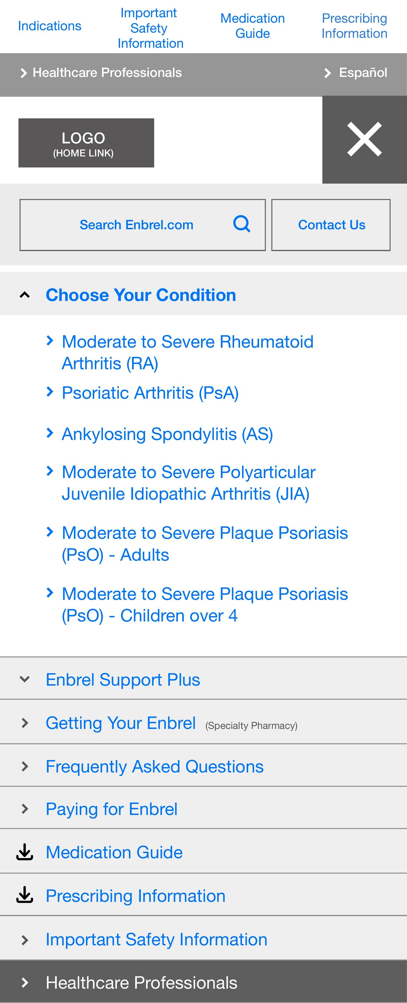
Mobile navigation open state — “Choose Your Condition” as the primary nav entry point, surfacing all six approved indications before any other content. Patients self-sort by condition on the first interaction, routing to condition-specific content rather than a generic product page. The condition-first hierarchy reversed the previous architecture where conditions were buried two levels below the brand narrative.
Condition-first navigation reversed the previous architecture — patients self-sorted by condition on the first interaction rather than navigating through brand content to find it.
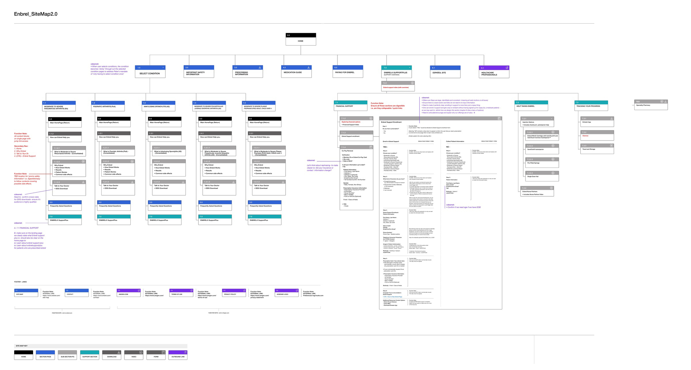
Enbrel SiteMap 2.0 — full information architecture delivered as part of WEBDEV2.0. HOME node branches into eight top-level sections: SELECT CONDITION (six indications, each with condition-specific sub-pages), IMPORTANT SAFETY INFORMATION, PRESCRIBING INFORMATION, MEDICATION GUIDE, PAYING FOR ENBREL, ENBREL SUPPORTPLUS (the current patient support hub), ESPAÑOL SITE, and HEALTHCARE PROFESSIONALS. Each condition branch carries parallel sub-page structure: condition overview, how Enbrel works, results, patient stories, common side effects, talk to your doctor, and DDO download. Financial support and injection training sections documented to form-field and flow-state level. 53 wireframe pages, R8–R14.
The full sitemap gave the WEBDEV2.0 team a build-ready IA — every page, branch, and sub-section documented to form-field level across 53 pages.
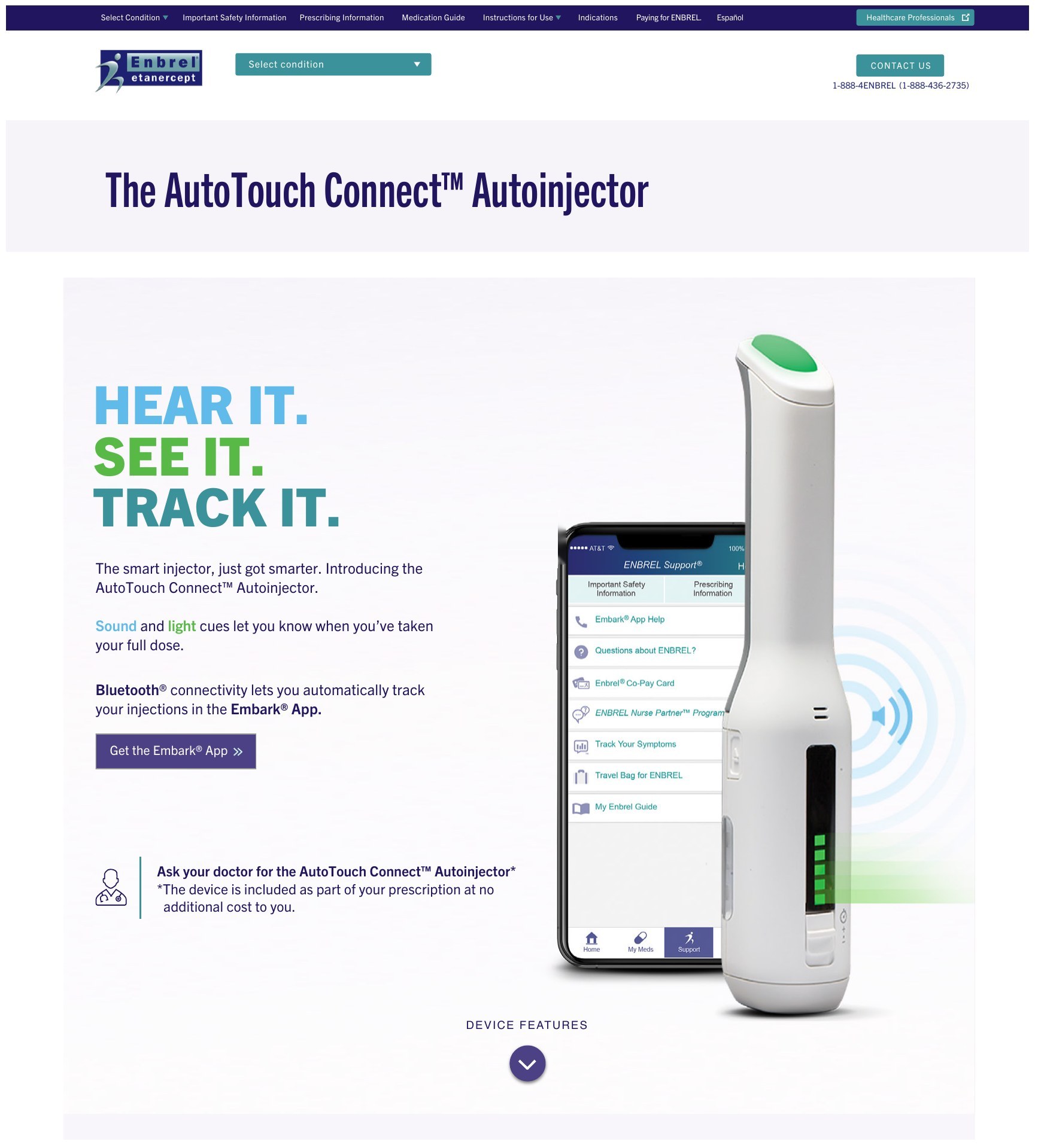
Related work on the same program: the AutoTouch Connect™ Autoinjector page, extending the site into device support. The headline direction “Hear it. See it. Track it.” leads into a single primary action, Get the Embark® App, with the no-additional-cost note kept as a secondary prompt to ask the doctor. Shown as designed during the engagement; the live site has since changed.
One clear next step from the device page into the Embark® App, the same destination the CRM onboarding emails point to.
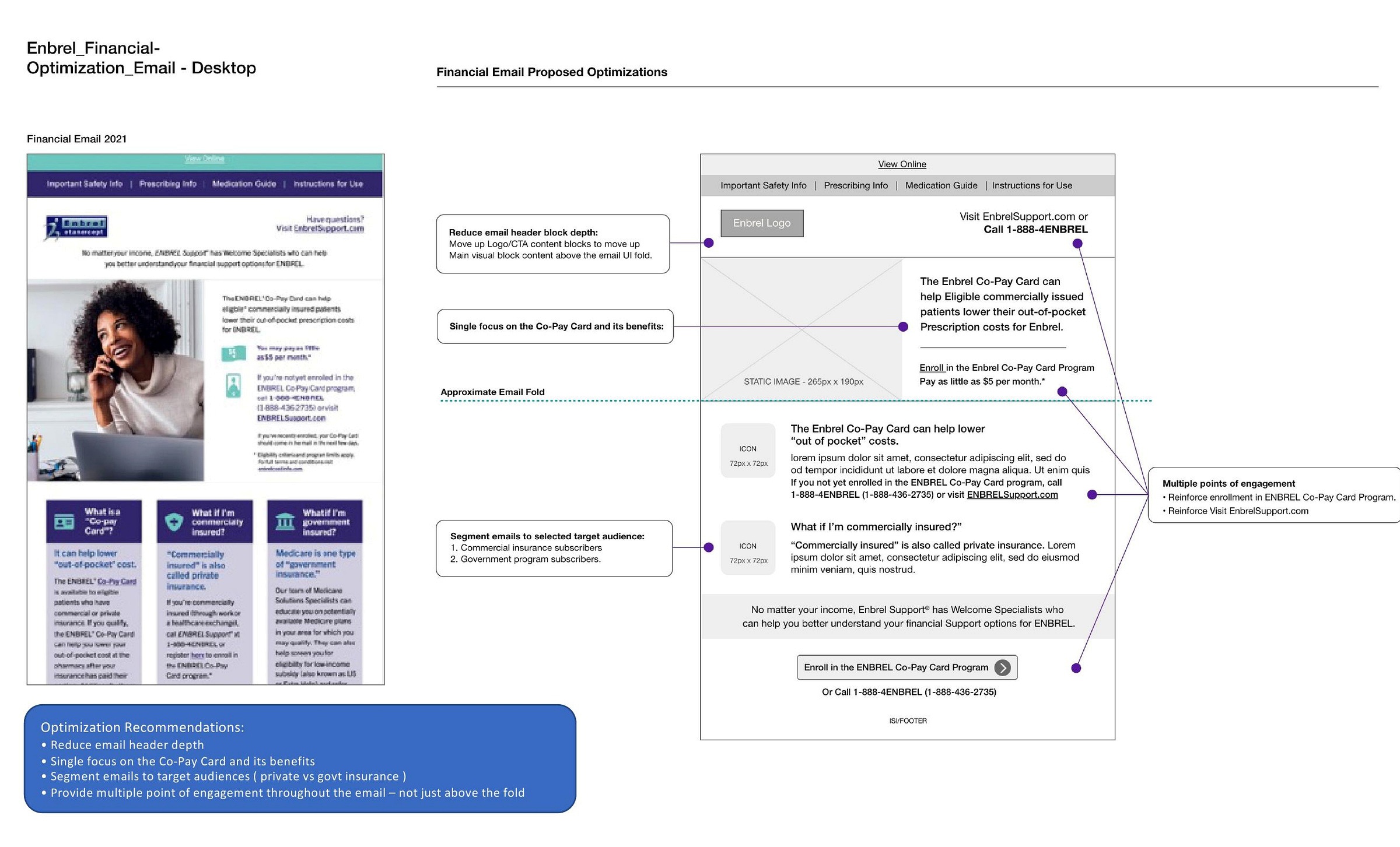
Related work on the same program: an audit of the Enbrel CRM onboarding emails. Open rates ran above the industry benchmark (36% against 21%), but click-through sat below it (4% against 5.5%). The Financial email shows the pattern: the 2021 original (left) asked patients to self-identify their insurance type before acting. The 2022 recommendation (right) leads with one benefit and one action above the fold, and splits the audience into commercial and government streams.
The brief said “improve CTR.” The audit found two different problems: actionable emails that failed at scan and engage, and informational emails that had no primary call to action by design.
The dual-audience diagnosis was right, and the Ipsos brief gave it defensible weight with the client. Two things worth pushing further: a competitive audit of other pharma DTC sites serving dual audiences, run before the research brief, to give the reframe external reference points the client could evaluate without commissioning a study of their own. And instrumenting the post-launch measurement framework before the redesign went live, not after the collapse became visible in monthly reporting — the Cardinal Path data told the story, but it was telling it six weeks late.