Digital Experience Design & Strategy
Designing a global UX framework that scales across markets, respecting cultural, regulatory, and health literacy differences while maintaining experience design consistency.
The experience design brief was built around a named patient persona (Andrea) with a documented emotional profile: frustrated, stuck, cycling through the same failed attempts, carrying both external and internal stigma, worried about her future health. Her experience was the design constraint. Everything from the homepage module sequence to the quiz learning prompt architecture was calibrated to resolve the specific emotional barriers Andrea carried before asking her to take any clinical action.
A global platform request concealed two distinct structural problems that needed to be solved sequentially.
"Design a global obesity platform that can be adapted for each market — KSA, UAE, Germany, Japan — while maintaining brand and regulatory consistency."
The brief frames this as an adaptation problem. It's actually two problems: first, identify which UX elements are structurally non-negotiable globally and which are genuinely flex zones — and that distinction hasn't been made yet. Second, obesity is one of the most stigma-loaded health conditions globally, and the UX must address the emotional reality of a patient who likely carries years of failed interventions and self-blame before it can make any clinical ask. The platform design challenge is global architecture plus stigma-aware emotional sequencing, not localization of a standard pharma UX template.
This reframe produced the global/flex zone architecture — defining non-negotiables centrally while building structured local adaptation into specific modules — and drove the stigma-reduction UX sequencing that opened the homepage experience.
Global wellness platforms & stigma-adjacent health conditions. The global constants / local flex zones architecture applies to any health platform scaling across markets where a condition carries cultural stigma. The stigma-reduction sequencing transfers directly to weight management, mental health, addiction support, and any condition where self-blame is a barrier to engaging with clinical content.
Neither Novo Nordisk property addressed all five content pillars — and their approaches were mutually exclusive. ItsBiggerThan.com (emotional/community) addressed empathy and health stakes but missed biological causation and HCP pathway. TruthAboutWeight.global (practical/scientific) addressed "not your fault" framing and biological cause but was weak on emotional validation and HCP conversion. Wegovy.com had 84% bounce rate despite 970K monthly visits — high traffic, low engagement. No competitor balanced all five pillars. Stigma was universal across all four markets, but manifested differently: social shame in Japan (searches included stigmatizing language), religious self-judgment in KSA/UAE, personal discipline failure framing in Germany.
I approached this as a global architecture problem with local sensitivity built in — locking non-negotiable IA and UX principles centrally, then naming explicit flex zones for regional adaptation. AI-assisted research surfaced UX patterns and content gaps across all four markets at scale. The five-screen Quiz Module, generating a personalized discussion guide, was the highest-complexity flex zone.
This site map framework defines the page hierarchy, content groupings, and experience design principles that had to remain consistent across all markets. The homepage anchored the experience with four stigma-reduction UX content modules before routing patients into four distinct experience pathways.
The site map established which UX elements were non-negotiable globally, giving regional teams a clear brief rather than an open brief — reducing late-stage drift across all four markets.
Four homepage modules forming the global constant zone — behaviorally sequenced to resolve shame, attribution, stakes, and agency before any clinical content is surfaced. Select a module to expand the design rationale.
Creates an opening without assigning blame. The patient must feel addressed, not judged, before any information has value.
The emotional barrier it resolves — shame-avoidance — is culturally invariant. Localising this module risks softening the activation signal.
Patient has accepted the premise that change is possible. Attribution of cause is still unresolved — must be addressed next.
Sequence constraint: modules must appear in this order across all market builds. Each resolves one emotional barrier before the next is surfaced. Reordering collapses the behavioral arc. Flex zones begin at section two of the site IA.
Five-section readiness ladder — each section has a gate condition that must be met before the next section's content has behavioral value. Select a section to expand content logic and global/flex designation.
Homepage — emotional foundation
Permission for the patient to engage with the subject at all. Shame and self-blame are resolved before any clinical information is presented.
The four stigma-reduction modules in fixed sequence. CTA is soft — discovery, not conversion. No clinical content until the module arc completes.
Understanding obesity — condition education
Clinical understanding of obesity as a chronic disease. Patient must accept the medical framing before treatment options carry credibility.
Global core: biology, comorbidities, systemic impact. Flex: specific comorbidity emphasis may be localised to market-prevalent conditions.
Weight management options — treatment landscape
Patient sees treatment as a legitimate, multi-modal space. HCP guidance is positioned as necessary context, not gatekeeping.
Global core: treatment categories and the role of medical management. Heavy flex: specific options, regulatory references, and reimbursement context vary by market.
Weight loss journeys — social proof layer
Patient confidence that people like them have navigated this. Social proof functions as risk-reduction — lowers perceived barrier to initiating an HCP conversation.
High flex zone. Patient stories reflect market demographics and locally prevalent emotional barriers. Voice and tone flex permitted.
Talk to your doctor — action conversion
Concrete action. Patient arrives having resolved shame, accepted the condition, mapped options, and seen social proof. The CTA is now a low-friction next step, not a leap.
Core: HCP conversation framing and preparation tools. Flex: HCP-finding tools, system entry points, and CTA phrasing vary by market access model.
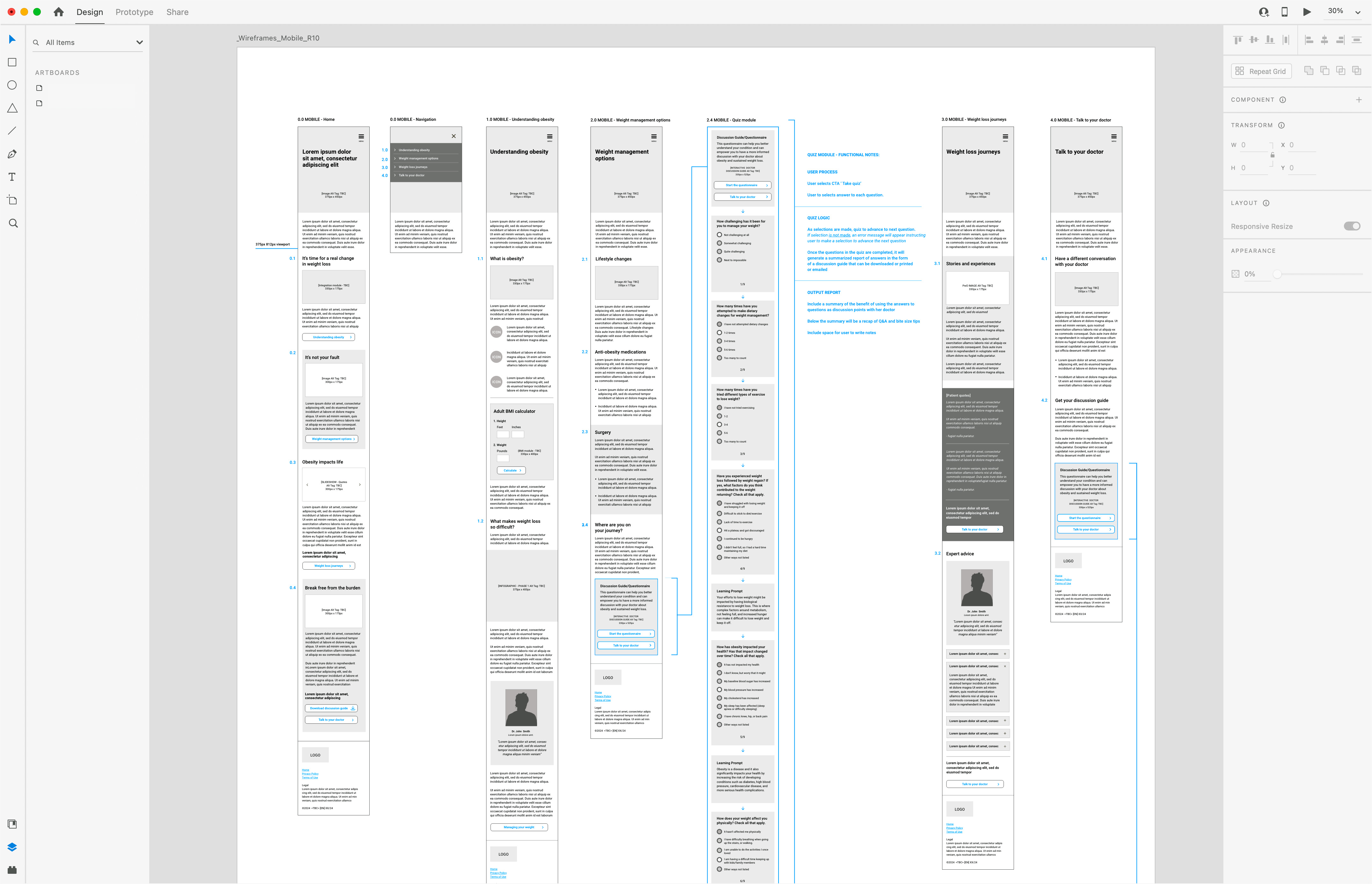
Mobile wireframes R10 — six-artboard mid-fidelity spread showing the complete five-section patient journey at 375px. Sections in sequence: Homepage (stigma-reduction module stack), Navigation, Understanding Obesity (condition education and BMI calculator), Weight Management Options, Quiz Module (personalized discussion guide generator), Weight Loss Journeys, and Talk to Your Doctor. The Quiz Module artboard documents functional logic across 9 questions with embedded learning prompts — clinical reframing delivered mid-flow at the moment a patient selects answers that signal biological resistance (e.g., "I continued to be hungry," "I didn't feel full") rather than deferred to the end of the questionnaire. The personalized output is downloadable as a PDF discussion guide for HCP conversations. All copy shown as lorem placeholder; structural hierarchy, interaction design, and UX sequencing are the deliverable. Pre-MLR working copy.
Seven validated mobile layouts gave regional teams reference implementations to adapt, not blank canvases — cutting per-market design time without sacrificing local precision.
The global/flex zone architecture scaled well across four markets. Local teams still needed a clearer signal — a governance decision tree telling them whether they're in a flex zone or a global constant, rather than catching drift in late-stage review. I'd also bring the AI research layer into cultural-sensitivity analysis earlier in the process. We applied it primarily to competitive pattern analysis; pointing it at regional patient voice content and health literacy signals during the research phase would have made the local flex zone design substantially more precise.