UX Audit & Lifecycle Experience Design
Reducing early adoption risk by identifying UX friction and redesigning the full patient lifecycle experience — from first touch through confident device use.
FreeStyle Libre was expanding CGM access into a mainstream healthcare audience — but the onboarding experience was built for early adopters. Drop-off during the critical first-use period was the measurable consequence. Patients received the right content at the wrong time, without a lifecycle experience model that understood where they were in the adoption journey.
My role: I owned end-to-end UX strategy and experience design for the FreeStyle Libre patient lifecycle — defining the lifecycle experience framework, CRM communication architecture, behavioral sequencing model, and service blueprint that aligned clinical, regulatory, and digital delivery teams.
Led agency-side, coordinating across UX, strategy, and account before engaging Abbott's clinical, regulatory, and digital teams. Every structural decision was stress-tested internally first — so what reached Abbott arrived as a recommendation, not an open question. Deliverables were built to be actionable across both organizations — no translation layer required.
The brief came in as a content and communications problem. The diagnosis revealed something structurally different.
"Improve the onboarding communications program — patients aren't engaging with the content we're sending them during device activation."
This isn't a content engagement problem — it's a sequencing alignment failure. The communication architecture was built around a content calendar, not a patient readiness model. Patients were receiving advanced CGM management content before they'd established basic device confidence. The content was correct. The timing was wrong. The fix isn't better content — it's a lifecycle UX model built around behavioral readiness stages.
This reframe drove the entire service blueprint approach — moving from a calendar-driven CRM model to a readiness-staged behavioral sequencing system across 10 phases and 88 days.
Connected health device onboarding & wellness app retention. Identifying readiness-stage transition points and designing proactively around predicted drop-off moments applies to any connected health or wellness platform managing a critical first-use period — CGM, insulin pumps, remote monitoring, mental health apps, and fitness platforms all face the same lifecycle UX challenge.
I approached this as a lifecycle UX alignment problem — not a content or campaign problem. I mapped the behavioral and emotional arc across the full first-use period — from device activation through sustained engagement — and used that model to redesign the communication sequence, content prioritization, and channel timing.
Early communications established device confidence. Mid-arc introduced lifestyle integration. Later-stage shifted toward habit reinforcement and long-term self-management behaviors. Ten distinct phases across 88 days, each with a defined behavioral objective and content design logic.
Quantitative analysis of where patients disengaged across the 88-day program. AI-augmented review of CGM adoption research. Competitive audit of 6 CGM and chronic condition onboarding experiences.
Drop-off spiked at week 1 post-activation (device confidence gap) and weeks 4–5 (lifestyle integration demand before habit was established). The calendar crossed both transitions without acknowledging them.
Phase 4 addressed the device confidence gap before advancing to lifestyle content. Phase 7 front-loaded behavioral reinforcement before introducing self-management complexity. Both designed around the known failure mode.
Connected health device onboarding & wellness app retention. Identifying readiness-stage transition points and designing proactively around predicted drop-off moments applies to any connected health or wellness platform managing a critical first-use period — CGM, insulin pumps, remote monitoring, mental health apps, and fitness platforms all face the same lifecycle UX challenge.
UX audit — patient readiness vs. content timing analysis. The foundational audit deliverable identifying the sequential gap that produced the 20% drop-off. Five patient readiness stages mapped against actual CRM content delivery timing, with a 12-point friction inventory across sequencing, content architecture, CTA logic, and support visibility.
This deliverable reframed the project scope — moving the client from 'improve content' to 'rebuild the sequence,' unlocking a full service blueprint engagement rather than a copy refresh.
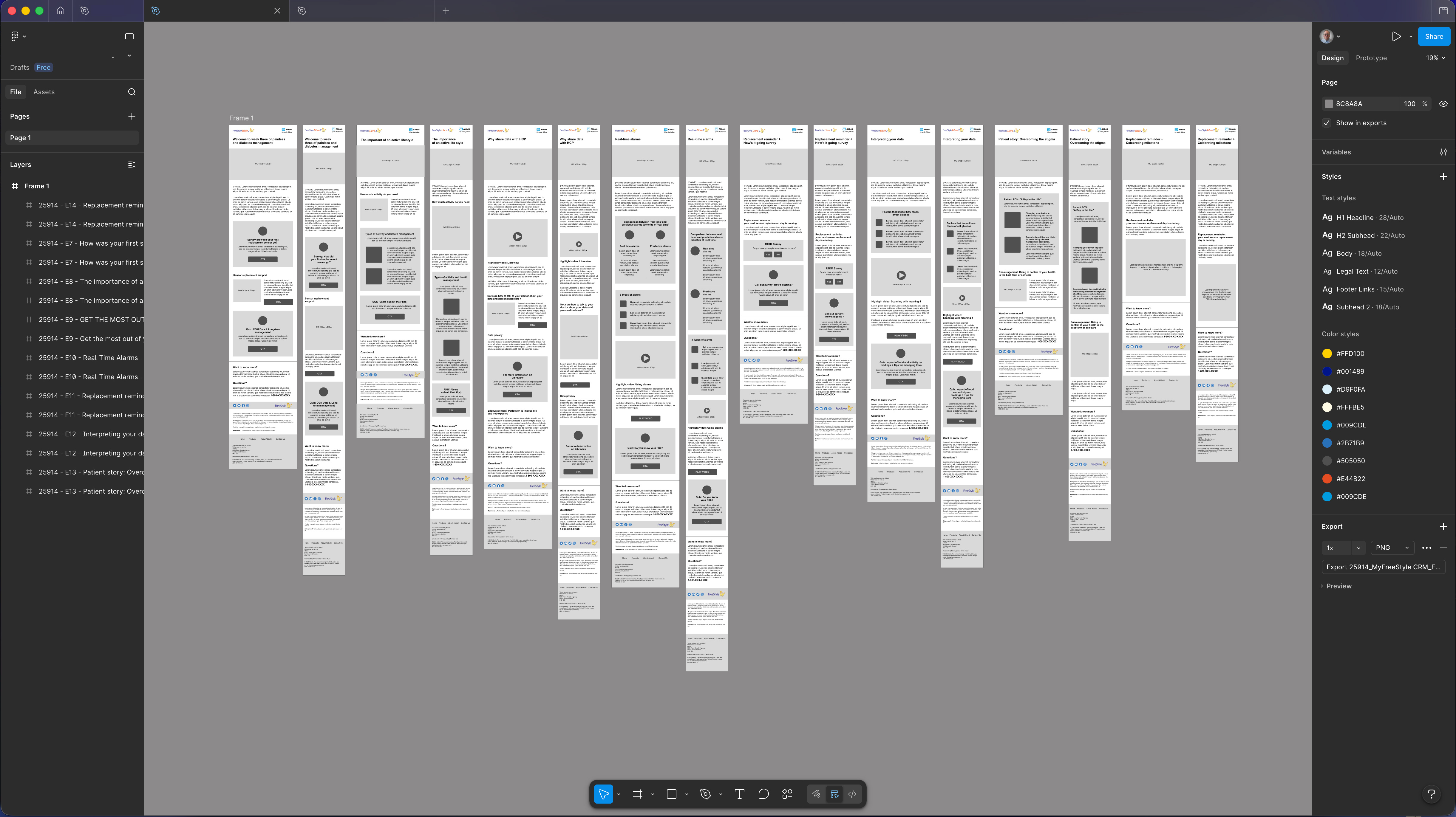
Full CRM wireframe suite — 14 email frames across the 88-day lifecycle arc, including A/B subject line variants and paired desktop/mobile layouts. Mid-fidelity delivery designed for MLR review alignment and development handoff. The wireframe canvas covers the complete programme sequence from device activation through graduation, with consistent type styles, color tokens, and component states applied across all frames.
Delivered directly into MLR submission, eliminating a second design pass and compressing the Health Canada review timeline.
Service blueprint — UX lifecycle architecture. The FreeStyle Libre CRM onboarding service blueprint defined the full patient lifecycle UX arc — establishing the phase structure, behavioral sequencing, and experience design logic across an 88-day engagement program.
Became the exec-ready brief that held the room without a UX translator — clinical, regulatory, and brand stakeholders could read and act from it directly.
Lifecycle communication experience design — translated the service blueprint into a complete experience design architecture spanning the full onboarding arc. Early communications established device confidence; mid-arc introduced lifestyle integration; later-stage shifted toward habit reinforcement and long-term self-management behaviors.
Translated the service blueprint into an actionable delivery sequence the CRM team could execute without UX present in every sprint.
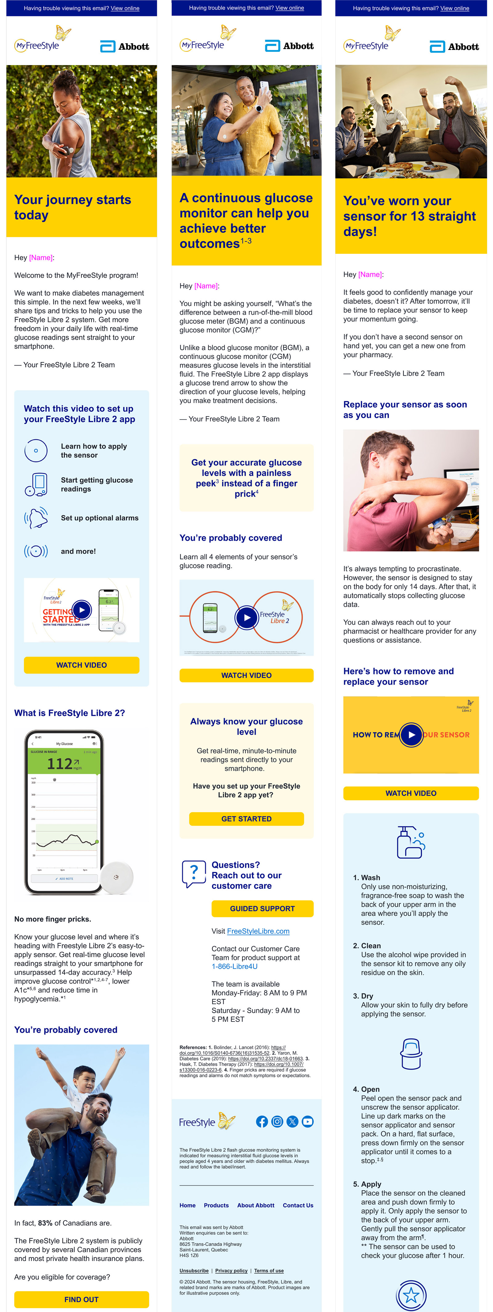
MLR submission artifacts — final Health Canada approved email experience design, carried through full visual production within the MyFreeStyle brand system: typography hierarchy, color-blocked CTAs, and lifestyle photography selected to match each phase's behavioral tone. Three emails represent distinct UX phases: device orientation, clinical understanding, and behavioral reinforcement at a known UX drop-off risk point.
Three representative emails used as proof of concept for the behavioral sequencing model during Health Canada MLR review — approved without revision.
Email content arc mapped to behavioral phase — 14 touchpoints across the 88-day onboarding program. The sequencing logic shows the deliberate ordering: device confidence and literacy before clinical framing, coverage scaffolding before behavioral reinforcement, feedback collection placed at the two known drop-off risk transitions. The arc also ran alongside a companion pre-event Getting Started stream (separate cadence, practitioner-led session) — two distinct CRM architectures operating in parallel.
The 10-phase behavioral model was the right architecture. Two things I'd add: a feedback loop that lets the phase sequence branch based on actual engagement signals — patients who demonstrate device confidence early advancing faster, patients showing inactivity signals getting a different intervention path before Phase 4. The data existed to support it; the CRM architecture didn't act on it. I'd also bring HCP-side journey design in earlier — the intersection between patient onboarding and prescriber communication is where the sharpest alignment gains are.