Experience Architecture & Competitive Intelligence
Designing oncology experience architecture to support informed treatment understanding across complex, multi-pathway disease management — backed by competitive landscape analysis.
Verzenio serves patients across meaningfully different disease stages — early and metastatic breast cancer — each with distinct treatment goals, support needs, and emotional contexts. A single UX model couldn't serve both without creating confusion or clinical risk.
The brief came in anchored to a measurable failure: MBC pages had a high bounce rate. The brand team's ask was framed around their named patient persona — "Pam" — and the specific problem of Pam not being able to find the efficacy data she was looking for. The tabs and anchors weren't informative. The navigation structure made the MBC clinical evidence hard to reach from any entry point. Performance data pointed to the structural problem; the brief asked for a data-driven diagnosis and recommendation, not a redesign.
The experience design gap wasn't informational — it was architectural. Content existed but the UX structure didn't reflect where different patients actually were in their journey. A single undifferentiated model created confusion and clinical risk for EBC patients who didn't yet identify as having a serious disease, and failed MBC patients who needed evidence and context before emotional support.
My role: I led experience design and UX architecture across the full Verzenio DTC ecosystem — a sustained engagement from Q1 2023 through February 2024 handoff covering the full dual-audience site across EBC and MBC indications.
Led agency-side across 13 months — aligning UX, strategy, and account internally before bringing the dual-sequencing architecture to Lilly's clinical, regulatory, and brand teams. Every decision arrived at Lilly with the rationale already made. By handoff, the architecture was documented well enough that both teams could own it independently.
The brief described a content problem. The real issue was a structural one that content alone couldn't solve.
"Redesign the Verzenio DTC platform to better serve both early breast cancer and metastatic breast cancer patients — currently the experience isn't differentiated enough between the two audiences."
The problem isn't insufficient differentiation — it's that both audiences are running through the same UX sequencing model. EBC and MBC patients don't just need different content; they need fundamentally different information architectures. EBC patients need emotion first — validation before evidence. MBC patients are further along their disease journey and need evidence first — clinical credibility before emotional support. Two sequencing models, not one with variations.
This reframe produced the EBC model (Emotion→Evidence→Action) and the MBC model (Evidence→Context→Support) as structurally distinct sequencing architectures served from one platform infrastructure.
Multi-condition health platforms & chronic disease management apps. Designing structurally distinct experience flows for audiences at different disease stages applies to any health platform where user states differ meaningfully — diabetes management, mental health, and chronic condition apps often collapse these differences into one model, creating the same structural failure.
Two UX sequencing models were designed: EBC — Emotion→Evidence→Action; MBC — Evidence→Context→Support. I mapped the full patient experience ecosystem across both disease stages, identifying where UX could share infrastructure and where experience design needed to diverge.
Five UX design recommendations per audience across six content areas, with six MLR watch items sequenced for regulatory review alignment. MBC was identified as the source-of-truth UX navigation pattern, with EBC adapting the structural foundation to its distinct emotional sequencing requirements.
Heuristic evaluation of breast cancer DTC platforms — Kisqali and Ibrance named in the brief as primary benchmarks, with broader oncology DTC architecture (including Talzenna) audited for structural patterns. AI-augmented IA analysis. EBC vs. MBC disease-stage emotional differences and treatment decision-making research.
Every platform audited applied a single IA across EBC and MBC — efficacy first, then mechanism, then support. No platform accounted for the fundamentally different information needs and emotional contexts between disease stages.
EBC: validate the emotional reality of diagnosis before introducing clinical evidence. MBC: lead with clinical credibility — these patients have been through treatment and evaluate support against a high standard.
Multi-condition health platforms & chronic disease management apps. Designing structurally distinct experience flows for audiences at different disease stages applies to any health platform where user states differ meaningfully — diabetes management, mental health, and chronic condition apps often collapse these differences into one model, creating the same structural failure.
MLR alignment process map — six-stage process showing how a dual-audience UX architecture (EBC and MBC) was brought through a single MLR review cycle. Specific stakeholder roles not disclosed per NDA; process structure illustrative of methodology.
This process map shortened internal alignment time — teams entered MLR review with agreed sequencing logic, not competing interpretations, enabling the single-cycle clearance.
UX optimization recommendations — four page-level UX improvements delivered as a client-facing strategy document. Each recommendation presented as before/after schematic with UX rationale. Specific brand assets not disclosed per NDA; structure and methodology illustrative.
Each before/after schematic was built to survive clinical and legal review without verbal explanation — the UX rationale was embedded in the artifact itself.
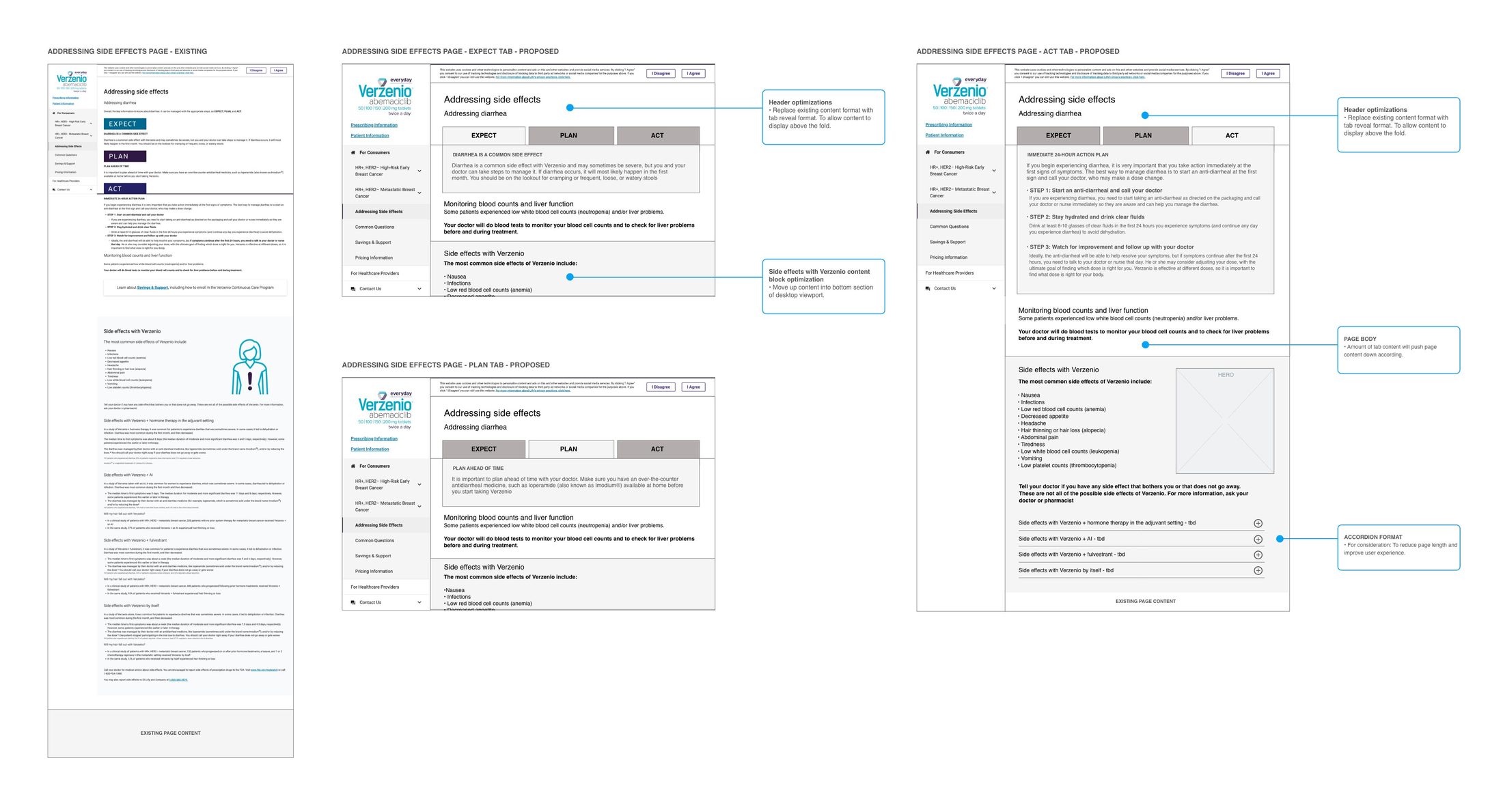
Side Effects page tab architecture — mid-fidelity wireframe comp showing the Expect → Plan → Act tab reveal structure across three states. Left: existing linear scroll layout with action content below fold. Centre: Expect tab active with annotation callouts. Right: Act tab active showing the immediate 24-hour action content surfaced within first viewport. Accordion format for side effects by treatment type shown in lower right. Client review deliverable prior to full asset development.
The tab architecture surfaced the 24-hour action plan at first viewport — resolving the most urgent patient need without adding page length or triggering a new MLR line item.
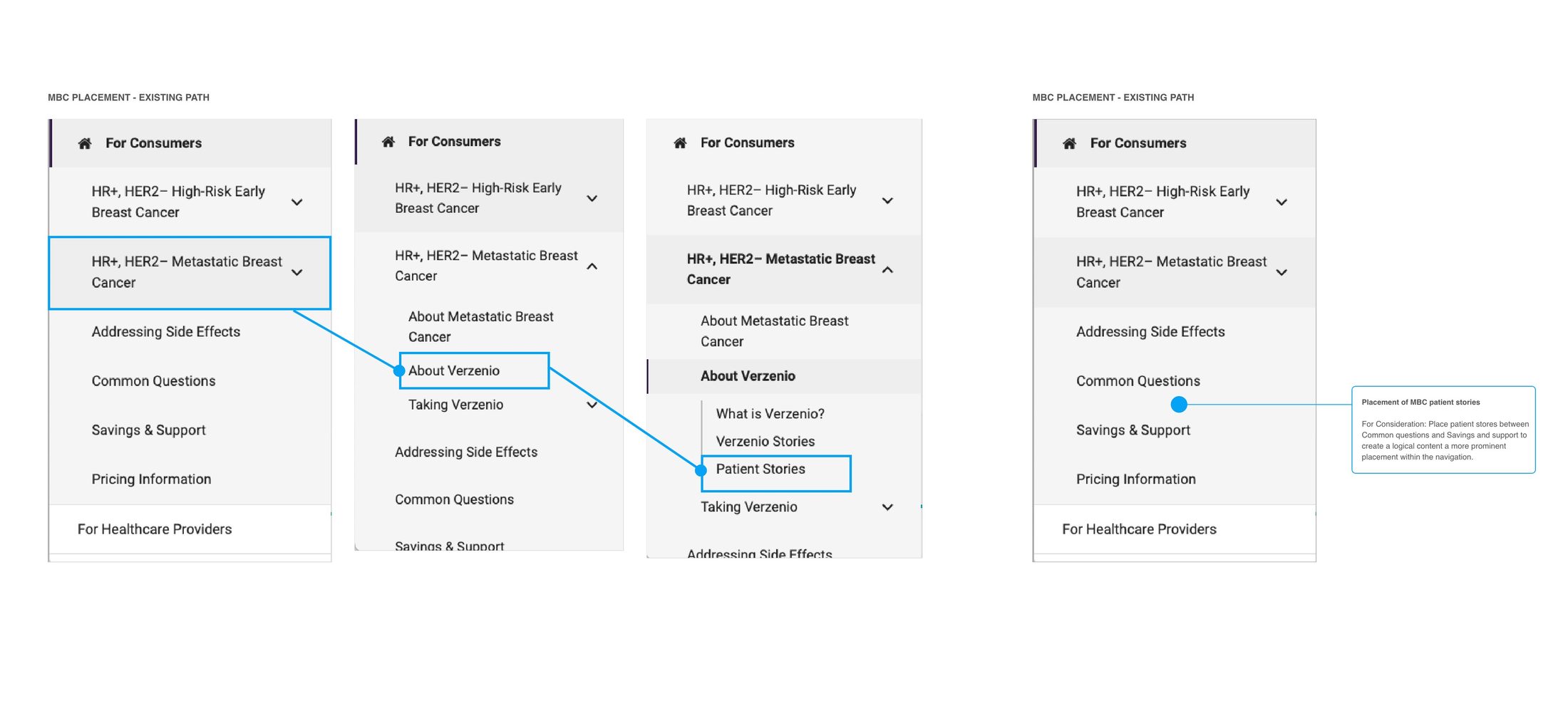
MBC Patient Stories navigation restructure — four-state wireframe showing the existing click path (3 levels deep through indication dropdown → About → Patient Stories) against the proposed primary navigation placement. Blue connector arrows trace the existing buried path. Proposed structure places Patient Stories between Common Questions and Savings & Support — one click from any page, reflecting the patient decision arc from clinical questions to peer validation to support enrollment.
Patient Stories moved from three clicks deep to one click from any page — the structural change that addressed the MBC bounce rate without requiring a content rewrite.
UX alignment framework — the primary UX strategy tool used to align clinical messaging, experience design priorities, and sequencing logic across two distinct patient audiences within a single DTC web experience.
This framework cleared both EBC and MBC architectures in a single MLR cycle — the sequencing logic was embedded in the document, not explained separately in the submission.
Audit scorecard — five UX recommendations sequenced across six content areas, weighted independently for EBC and MBC audiences, with MLR watch status and deadline flags carried at the row level for regulatory review alignment.
Mobile-first review of this same structure surfaced labeling and hero-visibility failures invisible on desktop — directly informing the decision to use MBC as the source-of-truth navigation pattern.
MLR submission artifacts — fully produced Verzenio DTC platform delivered following MLR review and approval across both EBC and MBC indications. Visual hierarchy and CTA design carry the audience distinction at the page level, while photography direction and color tone shift between the two patient journeys — quieter, more grounded imagery for EBC; more clinical confidence in tone for MBC — within a single shared brand system.
Final MLR-approved platform reflecting both sequencing models in production — EBC and MBC distinguished by information hierarchy, CTA design, and tonal art direction working together, not any one lever alone.
The dual-sequencing architecture was well-supported by the evidence. The one thing I'd shift: build the stakeholder case for structural divergence from the competitive audit outputs — before entering the design phase. When brand, clinical, and MLR teams can see that every competitor is running a single undifferentiated model, the argument for two sequencing architectures lands faster. I'd also bring more MBC patient voice into the evidence validation earlier; the disease-stage literature was strong, but lived experience data would have strengthened the MLR submission case for the Evidence→Context→Support sequence.