Beacon Platform — Patient Experience Strategy & IA
Reframing clinical trial participation as a guided decision journey — UX strategy and IA from discovery through enrollment in a regulated research environment.
Lilly's oncology clinical trials platform was fighting a specific and well-documented patient belief: that clinical trials are a last resort — something you consider after every other treatment option has failed. The engagement plan named this as the primary barrier: "the strong preconceived myths and mindset around clinical trials as a last-option for cancer therapy." The platform had to dismantle that belief before it could ask patients to consider enrollment.
Three distinct audiences were identified, each with a different primary barrier. Patients carried the last-resort myth. Caregivers lacked confidence to advocate for a clinical trial option on day one of a diagnosis. The general population simply didn't think of clinical trials as an immediate option following diagnosis. The existing platform addressed none of these barriers structurally — it was built as a trial inventory browser, not a decision-support experience.
The information architecture treated the enrollment decision like a marketing conversion. What was needed was a guided UX decision framework built around three overlapping patient journeys with different entry points, emotional states, and decision-support needs — not a brochure.
My role: I led UX strategy and information architecture for the Beacon clinical trial participation platform, working directly with clinical, regulatory, and digital teams within Lilly's enterprise design system. I owned the experience framework, journey design, decision support models, and content hierarchy from discovery through enrollment.
Led agency-side, coordinating across UX, strategy, and content internally before aligning with Lilly's clinical, regulatory, and digital teams. Every structural decision was negotiated across both organizations before it entered wireframe stage. By the time the progressive disclosure model reached wireframes, both teams had already signed off on the logic.
The most important design decision in this project happened before any design work started — reframing what the actual problem was.
"Build a platform that educates patients about Lilly clinical trials and helps them find trials they may be eligible for."
The architecture treats enrollment like a marketing funnel. But patients aren't making a purchase decision — they're making a medical one, under uncertainty, often in a health crisis. The platform needs to be built around how people actually make high-stakes health decisions, not around trial inventory search. The right model is a guided decision journey, not a discovery engine.
This reframe shifted the IA from a search-and-filter taxonomy to a three-stage progressive disclosure model — awareness, consideration, action — structured around patient readiness, not content volume.
Digital health patient engagement & DTx onboarding. The three-stage model applies to any health platform where users must build understanding before they can meaningfully act — patient recruitment, condition management apps, and health-tech enrollment flows face the identical structural problem. Any platform that leads with action before establishing readiness will reproduce the same drop-off pattern.
I defined a UX framework that mapped what patients needed to understand, feel, and do at each stage before asking them to act. Three stages — awareness, consideration, action — each designed as a standalone UX module that scaled without requiring structural rebuilds.
I owned the IA, content hierarchy, and decision support design across the full platform — translating clinical and regulatory requirements into a patient experience architecture that progressive disclosure logic could hold together across every page.
The phased delivery strategy balanced launch urgency with long-term scalability. Phase 1 established core experience across five sections. Phase 2 expanded on that foundation without requiring architectural rework.
Heuristic review of trial platform IA across pharma and research network sites. AI-augmented pattern extraction across structural models, content hierarchies, and patient pathway design. Audience barrier mapping across three distinct user groups: patients (last-resort myth), caregivers (day-one advocacy confidence gap), and general population (awareness deficit).
All eight platforms surfaced eligibility criteria and enrollment CTAs at the awareness stage — before addressing the belief that trials are only for patients who've run out of options. None modeled the cognitive and emotional arc of a patient newly navigating a trial decision in an oncology context. The IA structure of every platform assumed a patient already persuaded; none built the persuasion.
Stage 1 (Awareness): normalize clinical trials as a first-choice option — directly address misconceptions and realities before any trial inventory is shown. Stage 2 (Consideration): evaluate fit in plain language across patient, caregiver, and general population entry points. Stage 3 (Action): eligibility screening and enrollment pathway.
Digital health patient engagement & DTx onboarding. The three-stage model applies to any health platform where users must build understanding before they can meaningfully act — patient recruitment, condition management apps, and health-tech enrollment flows face the identical structural problem.
Patient journey map & UX site architecture — phased UX delivery strategy for the Beacon platform, balancing launch urgency with long-term scalability. Phase 1 established core experience across five sections, each designed as a standalone UX module while serving as the foundation for Phase 2 expansion.
The journey map shifted the internal conversation from 'what content do we build' to 'what does the patient need to understand before they can act' — establishing the progressive disclosure model as the organizing logic before any design work began.
Information architecture & experience design framework — translated the UX site architecture into a full information hierarchy model, mapping how clinical content is sequenced across all trial types to support progressive patient understanding from awareness through enrollment.
The IA framework was used directly by the MLR team to evaluate content placement decisions — eliminating a separate regulatory translation layer and accelerating the review cycle.
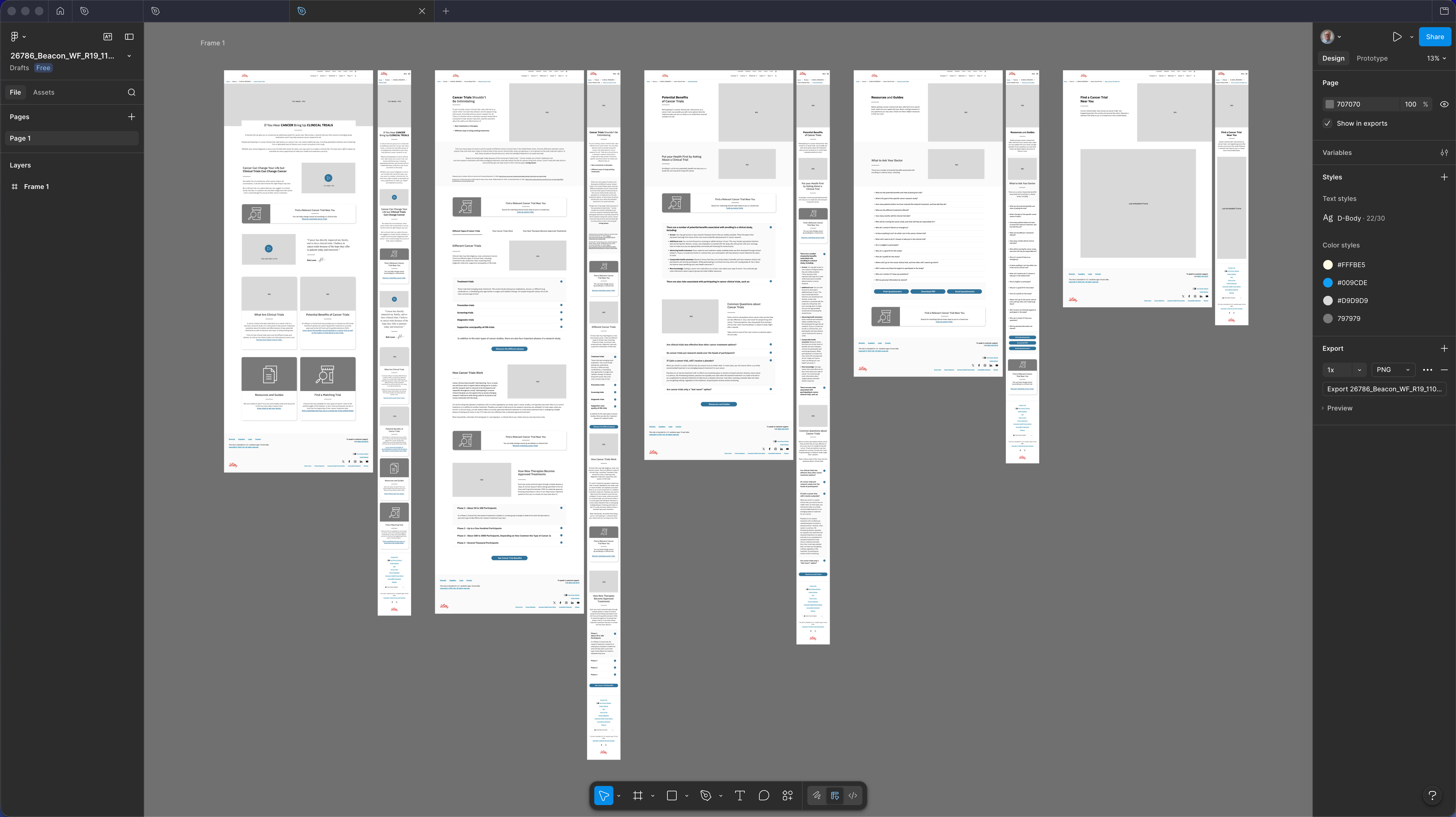
Desktop wireframes R19 — five-section spread showing the complete Beacon patient journey at desktop viewport. Sections in sequence: Homepage (awareness entry, cancer-to-trials narrative hook, enrollment benefits, find a trial tool), Clinical Trials Overview (What Are Trials, Potential Benefits, FAQ accordion), Misconceptions & Realities (directly addressing the last-resort myth — the primary patient barrier identified in the engagement plan), Trial Detail (eligibility criteria in plain-language UX treatment, common questions, risk disclosure integration), Resources & Guides (downloadable decision aids, Questions to Ask Your Doctor), and Find a Trial Near You (trial-matching interface). Regulatory disclosures designed as structural content components throughout — not footer or modal interrupts. Built within the Lilly Design System. Pre-MLR working copy; structural hierarchy and progressive disclosure logic are the deliverable.
Desktop wireframes at R19 reflected a fully negotiated IA — structural decisions had been validated with clinical, regulatory, and digital stakeholders before this delivery, so the wireframes moved directly to MLR submission.
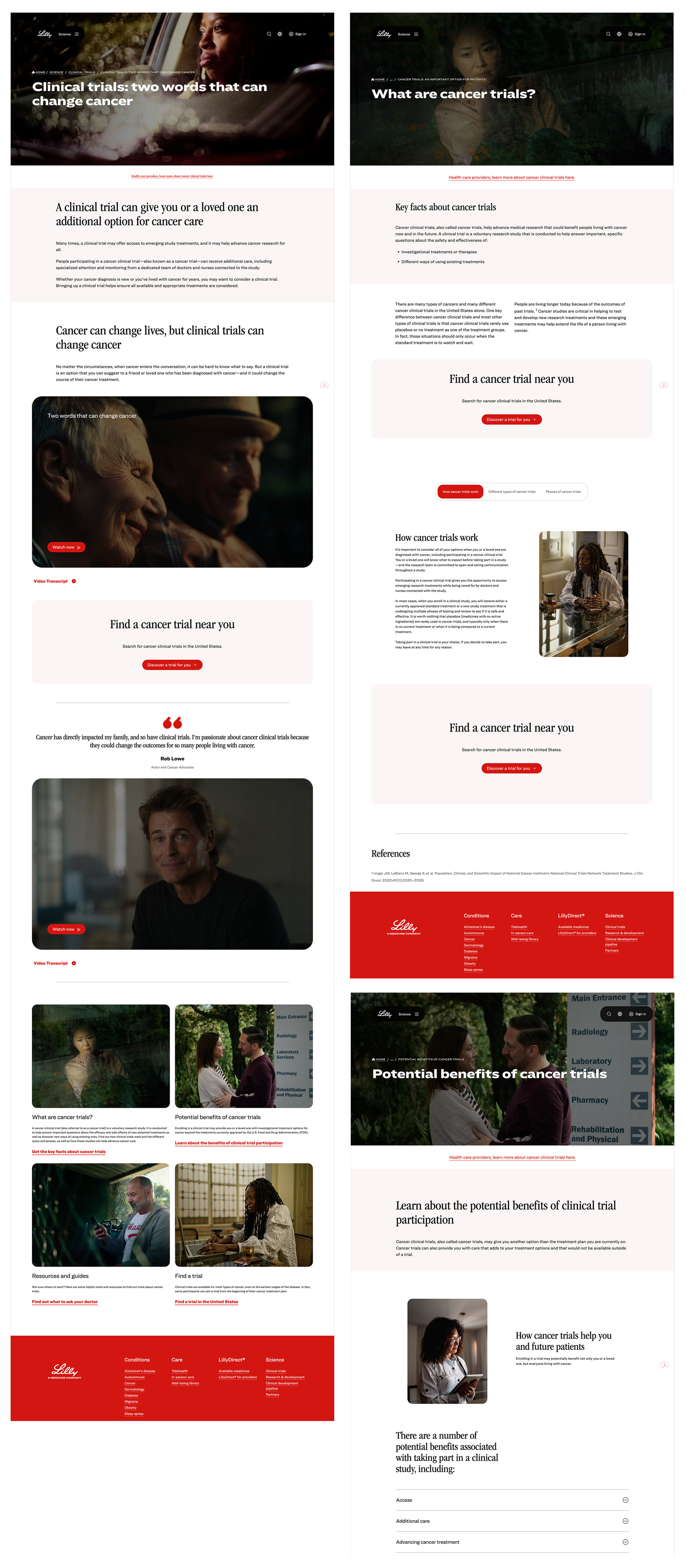
MLR submission artifacts — three representative pages from the complete Beacon platform, designed within Lilly's editorial visual language: dark cinematic hero photography and serif display type chosen deliberately to read as journalism rather than pharma marketing, reinforcing the myth-first tone before any clinical content appears. Pages illustrate UX content hierarchy and progressive disclosure design across three distinct stages of the patient decision journey. Clinical references and regulatory disclosures integrated as structural UX elements.
Three produced pages illustrating the progressive disclosure model in action — used as architecture proof in the MLR submission to demonstrate that regulatory disclosures could function as structural UX elements rather than modal interrupts.
The progressive disclosure model held across the full platform. Two things I'd refine: first, instrument a readiness signal at entry so patients who arrive already informed — via HCP referral or prior trial experience — can branch at Stage 1 rather than moving through awareness linearly. Second, start the plain-language eligibility negotiation with MLR in the strategy phase, not mid-design. Getting there earlier buys timeline and produces a sharper Stage 2.