Audit, UX Recommendations & Wireframes for WhatIsShingles.com
Auditing GSK’s unbranded shingles site, then turning what the data showed into wireframes, layout comps and a content matrix for a relaunch.
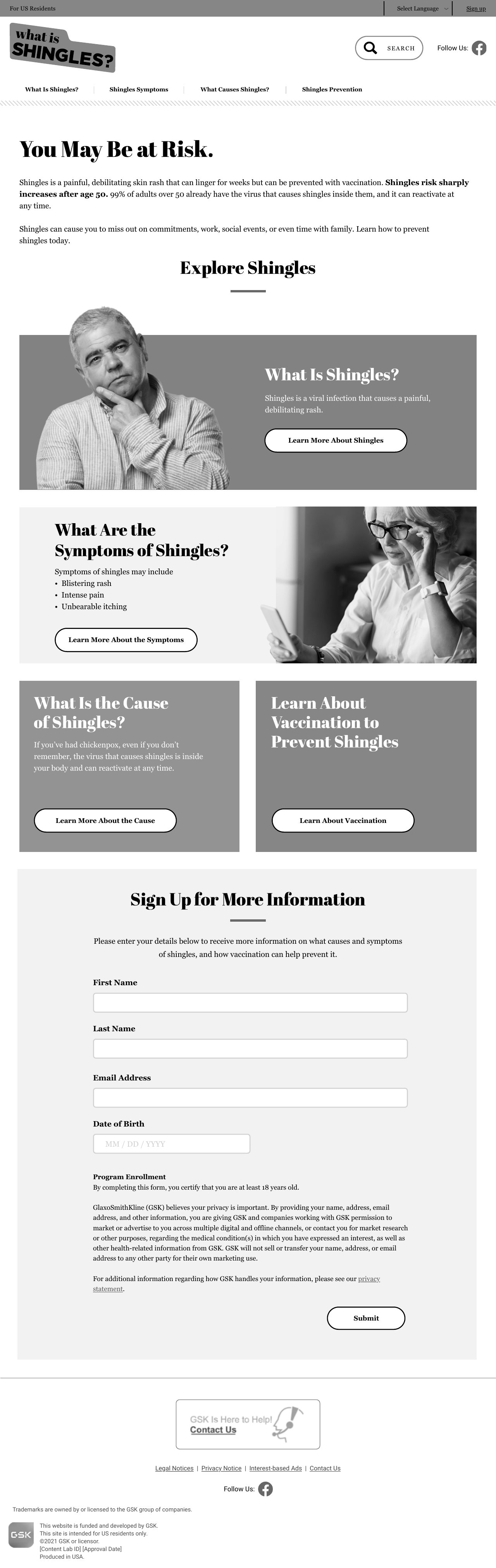
Greyscale layout comp (round 12, August 2023) with placeholder color. It shows the risk message in the first sentences, four paths into the site, and the sign-up form at the foot of the page. Click to see the full page. This is a design deliverable, not the live site.
WhatIsShingles.com is GSK’s unbranded shingles site. It exists to raise how at risk people feel and how much shingles would disrupt their lives, so they move toward prevention and sign up for more information.
Eight high-value actions were tracked, from watching three patient videos to clicking a rash carousel, learning about prevention and signing up. The brief also moved the priority audience to Susan, the person most worth converting and the hardest to move.
Of 452K journeys that began on the home page, 97% ended there. Only 0.1% went on to Sign Up. Home, Prevention and Causes all bounced above 70%. 82% of visits were on phones, and Safari mobile bounced at 85% against 69% on Chrome.
The sign-up wasn’t failing. Getting to it was. The Sign Up page itself bounced at 4%, ten times lower than the next page. People who arrived there acted. Almost nobody arrived, so the fix was to put sign-up and the key messages on the page people landed on.
Condition-awareness sites fed by paid search and social. When most visitors read one page and leave, each landing page has to carry the message and the next step by itself. Don’t count on a second click.
The audit was a joint effort across GSK’s consumer team. pGSK covered media and SEO, CIEN covered imagery and Targetbase covered CRM. My team scored the site’s content, information architecture, UX and design on a five-point rubric, from usable as is to needs a full rebuild, and read each page against the traffic data. Most pages scored “usable, with opportunities.” The work was to find the small changes that would matter most.
GSK’s USXF platform set the limits. Templates are standardized and new features need a business case, so I looked for ways to reduce page depth: move high-value content above the fold, use one CTA style, add a scrolling CTA, use icons and accordions. Where the template blocked an idea, the wireframes say so.
Accessibility ran through the audit and the brief. A summary scan flagged 12 potential WCAG issues: 9 affecting visual impairments, 2 motor and 1 cognitive. The brief turned them into three mandates: meet the contrast minimum, give every image alt text, and tie each form field to its label. The wireframes carried those mandates in the annotations and specified alt text and file names for every image.
The wireframes were deliberately plain, with greyscale boxes and numbered annotations tying each change to an audit finding or a brief objective. That kept feedback on structure, messaging and function before any visual design. When GSK asked for a fuller relaunch rather than a refresh, a grounding session and a content matrix set the story flow page by page.
Share of visits that ended on the entry page, and how many went on to Sign Up
Visits that started on each page, with the share that left after that one page. Sign Up was the next page for 0.1% to 0.5% of visits. Source: Adobe Analytics, June to October 2022, from the joint audit with pGSK, CIEN and Targetbase.
Don’t count on a second click, so put the next step on the first page.
Bounce rate by page, 90 days
Bounce rate by mobile browser (site average 74%)
Pages that explained shingles in detail kept people reading, while Home, Prevention and Causes lost most of them. Sign Up bounced at 4%. Safari mobile ran well above the site average, which the audit flagged for development to investigate.
People who found Sign Up acted. The redesign had to help more of them find it.
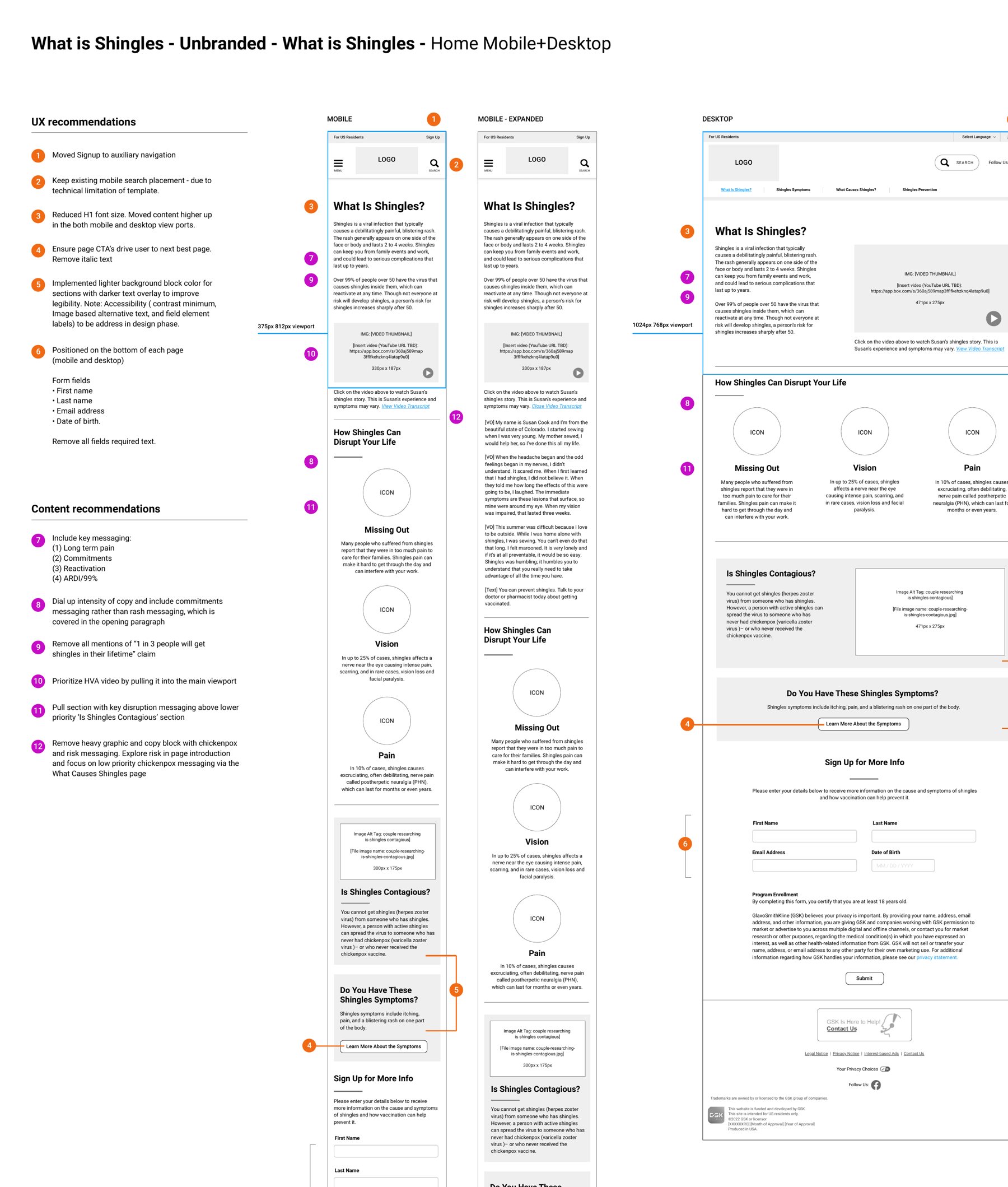
Review 1.1, August 2023. Design is stripped out on purpose. Numbered notes tie each change to the audit or brief: sign-up in the top utility bar, smaller headline so content rises on phones, CTAs that point to the next page, a lighter background behind text for contrast, and the “1 in 3” claim replaced.
Reviewers could react to structure and messaging without arguing over color or imagery.
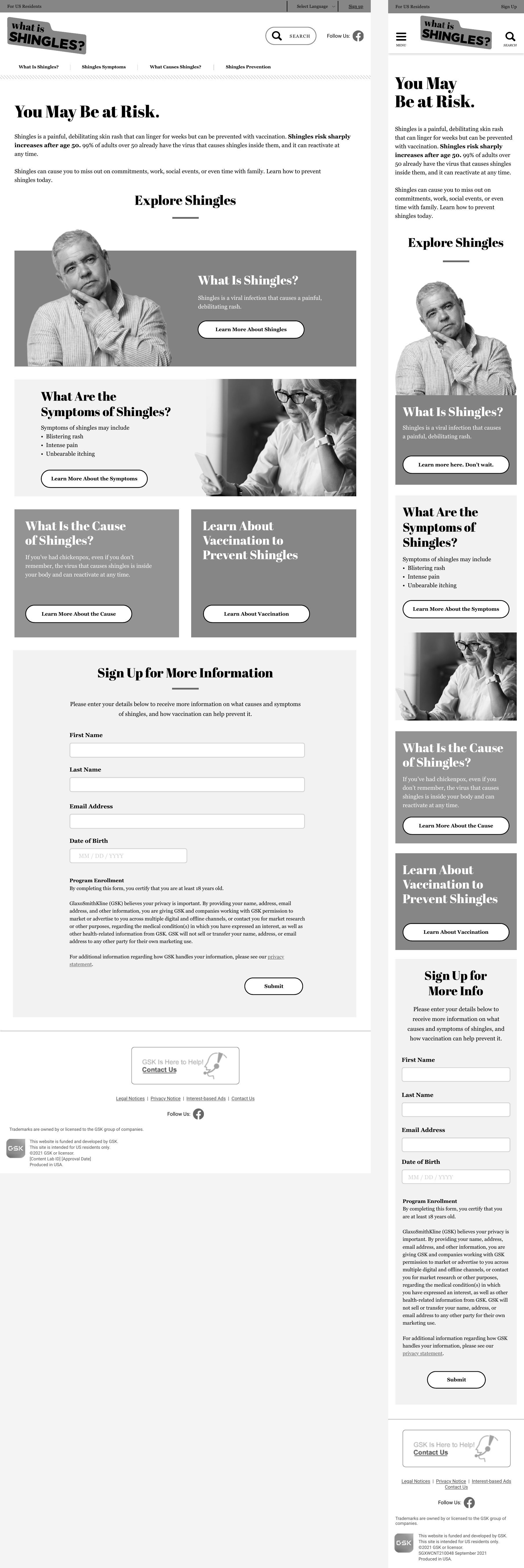
The same home page after layout and content moved into place. The risk and disruption messages lead, and four large panels replace a link list: what shingles is, symptoms, causes and prevention. Sign Up sits in the top bar on both screen sizes. Use the button to see desktop and mobile at full length.
The opening paragraph now carries the risk, reactivation and disruption messages in its first sentences.
The audit recommended removing Last Name and Date of Birth from the sign-up form, since neither was being used. GSK required both, so the wireframes, comps and content matrix kept them. On a similar project I’d put field-level drop-off data in front of the client early, so the cost of each mandated field is weighed before layouts are locked.
The build went to another agency after GSK’s consolidation review, so I can’t say how the relaunch performed. On a similar project I’d agree up front on a handful of shareable measures, such as second-page rate, home bounce and sign-up completion, and set a baseline from the audit, so the work can be judged on more than the recommendations.